Sea and Sky Scarf

I had a lot of fun recently working on a commissioned scarf for a woman in France. She wanted a scarf in her favorite colors, dark grey and blue. One of her favorite memories is of looking at the sea one day, and where it met the sky, and seeing so many shades of blue and grey together. I didn’t have yarn in the specific shades she was looking for, so I had a lot of fun dyeing it.

I dyed the yarn while it was tied up in “braids” specifically to get an “uneven” dye effect. I like that there are areas that are lighter or darker. My favorite yarn is the one that is part blue and part grey. I first dyed it in the same grey bath as the warp, but removed it early. I then unbraided it and re-braided it to expose different areas of the yarn. Then I partially dip-dyed it in the same dye as the blue. This created lovely randomness in the transitions between the blue and grey.

I’m definitely pleased with how this scarf turned out. It was lots of fun to sort of spontaneously dye a whole lot of yarn and just see what happens!

Autumn Colors

I’ve made a couple of these scarves at this point, it seems to be one of the most popular color combinations. Its one of my personal favorites, so I can understand why. It’s also the perfect time of year for them. This scarf just sold on Etsy, and I couldn’t miss the opportunity to take some photos of it on this glorious fall day. It matches the leaves around me perfectly.

neck-sm

Dyed Warp Scarves – A study in teal

These are two scarves I did much earlier in this year. A fellow crafter and I worked out a deal for trading commissioned art objects. I wanted a carved hair pin, and she wanted a woven scarf. This is the hairpin I ended up with, which is amazing and perfect and exactly what I was hoping for. I love that it stares at you. 13221208_944075643278_2196960803119822986_o

When talking about what she wanted in a scarf, she has a favorite shade of blue-teal-gray-silver that she loves. Of course, finding the exact right shade was going to be impossible, so I decided to play with dyeing my own yarn.

The base yarn was my ever favorites Earth Guild Dragon Tales boucle yarn. Its a rayon fiber, so easy to dye. And the boucle structure means it catches light well, is somewhat shiny, super absorbent, and simply easy and fun to weave.

I think its always interesting to see how colors play with each other when weaving, its not like any other art I’ve played with. Both of these scarves use teal yarn from the same dye lot in their warp. But because of the other yarns they are paired with, you end up with dramatically different scarves.

Both scarves use the same tie-up, a broken twill design that creates interesting diamond shapes. The one on the left uses Dragon Tales “taupe” color for the weft that lightens the effect and gives it an excellent gold shimmer. The one on the right uses the same dyed teal in the warp and the weft, but also their “autumn spice” variegated yarn as stripes down the warp, and to create an color transition effect at each end of the scarf.

In the end, neither scarf was the exact shade my friend was looking for. But she said this gold-ish one “called to her heart,” so I consider it and overwhelming success.

The one I call “circus colors” is still available (etsy link), if you feel like falling in love with it…

Twelve Scarves of Christmas

UPDATE: if you love these scarves as much as my friends and family did, I’m selling more of them in my esty shop for this christmas!

Well, I was very very busy for the weeks up to christmas. There are a lot of photos for this post, but I assume you guys wont mind. I, of course, decided to give everyone a scarf. Scarves are so fun and easy, when you get into a rhythm they don’t even take very long, you get to change up the colors frequently, and they’re just so satisfying.

There’s a local to Asheville yarn store called Earth Guild that does their own dye of some rayon weaving yard. It is absolutely gorgeous, and I’ve been eyeing it for awhile now. They also sell hand-painted warp scarf kits. The yarn is already measured and painted for you, and they provide warp and weft all in a bag. Just warp your loom and you’re ready to go! I confess, once I did the first one and saw how fun and easy and BEAUTIFUL they were, I went a little crazy. The given color combinations are absolutely gorgeous, and with everything pre-mesured, as long as I stayed in the twill family, I simply just tied on new ends to the old ones and didn’t have to do 75% of the annoying pre-work bit.

The only two that weren’t pre-painted kits were the two ones I did with their line of variegated yarns. There’s one foresty green and blue scarf, and a golden scarf with purple and reds. Same weight as the other yarn, just the warp is a variegated and the weft is a solid color. For a couple of inches at each end, I also used variegated in the weft, and then slowly transitioned to the solid to create a nice ombre effect. Does it happen to correspond very closely to the very first scarf I did? maaaaaybe 😉 But it just looks so good!


Anyways, it was so delightful to use Earth Guild’s scarf kits. They are the perfect project in a bag, easy, beautiful, somewhat addictive. They’d also be great teaching tools, they easily display the basics, leave out part of the math, good strong soft yarn, the colors look amazing and hide simple flaws, and they don’t take long at all! Any friend that wants a good project to learn to weave on is welcome to come sit at my loom one weekend, and I’ll show you the basics!


You’ll also note that I got the boy to model for me, as long as I also promised to model, haha! Everyone keeps asking for it, well, I’m finally going to attempt to take more photographs of me actually wearing the things I make.

Bridesmaid Dress

This was a dress I did to be a bridesmaid in a friend’s wedding last summer. And yes, you’ve seen this pattern before, its one of my favorites. Its the Retro Butterick 5630 dress.

I lined it and added some green tulle to simulate a petticoat and add a little flash of color when I twirled.

Its made out of spoonflower sateen that is hand-dyed. It was a charming and fun wedding. Each of us made our own dresses and dyed them. The bride and groom are some of my closest friends, and they know how to throw a wedding.

I reviewed this pattern here: Butterick Retro Dress B5603 ★★★★★

A Dress for 1914, January

So, I was teaching myself about gradient dyeing…. I wanted to create a dress for Neil Gaiman’s Calendar of Tales, from his January story. This is 1914’s dress. If you haven’t read his stories, or heard about his project, you need to! No really, check this out, right now. I’m not posting a full image of the dress here, because I want the final image to be a bit of a surprise…

My objective for the dress was to imitate the styles shown in Downton Abbey, the season 1 dresses at least, because they were mostly set in that time.

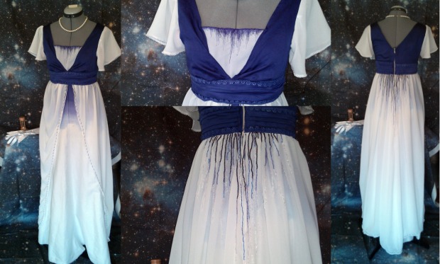
I’m not entirely satisfied with this dress. Its a beautiful dress (if I may say so myself!) but its not the effect I was going for in the end. To me, it looks more disney princess than anything else. I think my problem is mostly that I used two such contrasting colors. Most dresses from the time stuck to one color family. However, The Man Himself specified 1914’s long white skirt, and, well, I didn’t want to do an all white dress because it’d feel too wedding dress-y. And I was in the mood to try something new, I’d been reading about ombre dyeing and I wanted to try it myself.

The dyeing went wonderfully! That was also half the problem. My original plan was to have an over dress of the white chiffon that toned down the darkest purple on the bodice. But that shade of purple was just so beautiful, and the chiffon wasn’t as transparent as I wanted it to be, so ended up not doing a full over dress.

I think if I’d had more time I could have added a lot more embroidery, and that would have been truer to the 1914s super elaborate styles and fashions. If I could have added some beading and heavy embroidery to the skirt, I think it would have been perfect.

Gradient dyeing was definitely fun, and an effect I plan to use again in the future.

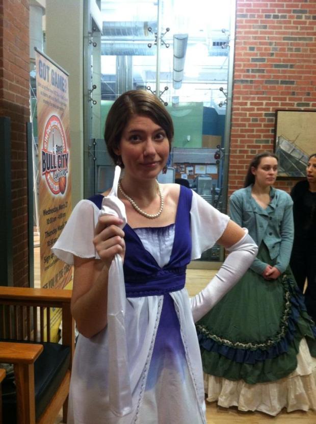
We had the photo shoot for the project last thursday. The picture is from when we were preparing for the shoot, we were gathered in the lobby of a local building, and my glove was feeling rather contrary (Photo by Kelsey, a gorgeous model)….

calendarcandid

This photo is of the scene in January, when 1914 greets 2012 in the place where years go when they’re over. In the background, you can see several of the other years hanging out, enjoying life beyond time.

final

The photography was done by Sonja of Soulfire Studios ( facebook , tumblr ). Isn’t it fantastic? Everything feels magical and sort of timeless. (My favorite part is how she got the color of the water to actually match my dress, haha).

2012 is modeled by Matthew Sumner, of Beat Down Boogie.

I think my favorite part of this project is that I didn’t even know half the people I was working with when it all started. I just decided “Hey, I want to do this. I won’t be able to pull it off alone, so I should find some other people who want to do this.” And I sent out a bat signal, and friend of friends of friends responded. And this happened. And it was fantastic. Love of art and love of neil gaiman collide, and cool things happen.

I chose to work with the January story for several reasons. One of the easiest reasons is because it was one of the only stories where clothing was mentioned, and I wanted to sew something fantastic and fun. It was also the most Gaiman-esque story in my opinion. It left so much open, there are so many more stories just aching to be told. One year, one lifetime, second by second, battling a fight…

Anyways, this is the dress I imagine 1914 would be wearing. I copied a style similar to what fashion was like historically during that time, with a high waist, straight skirt, and lots of embellishments But I took a few liberties of my own, of course…

I also very much liked the imagery of sand trickling through an hourglass, and I tried to incorporate that theme in as many places as I could. The main fabric of the dress is gradient dyed, going from a deep midnight purple at the top and fading to timeless white. The embroidery on the bodice echoes that transition, and the shape of falling grains of sand. The beading in the back train of the dress does the same, individual beads trickling away like seconds of time.

dress

Gaiman builds an image at one point in the story, the final grain of sand caught in the hourglass, the final second of Twelve’s time… One grain of sand per a second, for a year. I’d like to say there are as many beads on this dress as seconds in a year… But I did the math, and that comes out to be 31,536,000. Thirty one million, five hundred thirty six thousand seconds, in a normal year. (I wonder if the personalities of leap years are different? See, there’s a whole new story someone could write within this story…)

There aren’t that many beads on this dress, but there are probably a good couple of thousand.

Edited at 1:26pm local time (which happens to be 5:26pm GMT): Actually, I missed submission time by TWENTY SIX MINUTES. FML. Stupid Greenwich Mean Time. Also curiously appropriate, given my mental meanderings on the meaning of seconds, and time, etc etc. *sigh* Oh well. such is life.